Woollahra Group is consciously committed to manufacturing environmentally responsible cleaning products for use in remote sites, domestic, agricultural and industrial environments.
“Woollahra” means meeting place. The circle graphic at the centre of the wordmark represents a meeting place or yarning circle, with 15 dots inside representing the founding traditional land owner partners. The songlines leading into the circle represent Woolahra’s three founding Directors Chris Schmid, Reen Richards & Sam Smith. The lines leaving the circle represent the values, learning and respect shared when we work together to deliver important outcomes.
This design is part of a broader brand relaunch to reflect the ‘Helping Community & Country’ model. Woollahra Community Initiatives ensures that funds are used on meaningful projects that deliver important social outcomes.
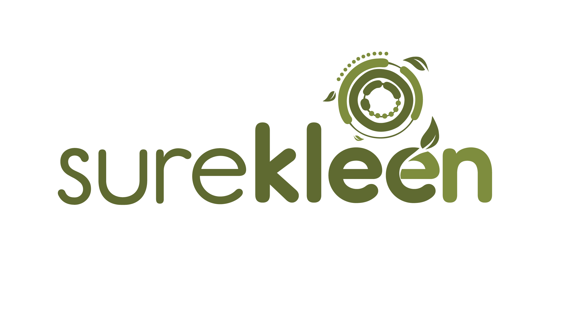
Nani Creative also developed a complementary brandmark for Woollahra’s Surekleen product line. Surekleen is the only Indigenous-owned cleaning chemical manufacturer in Australia. Produced with 97% eco-friendly ingredients, the bottles are reused up to 50 times. Customers return containers to be refilled, creating a circular economy. This provides the inspiration for the graphic expression of the ‘e’ in the Surekleen logotype.